Wednesday, December 14, 2011

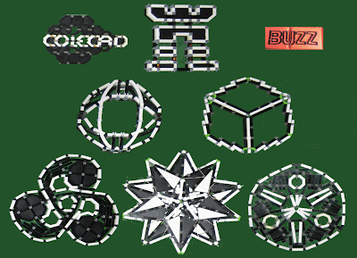
BUZZ Logo Project


My BUZZ Logo Project made over 20 years,
as sketch,
DeluxePaint file,
Imagewriter Heat Transfer Printout,
created in Construx between 2009 & 2010
based on the logos from

"BUZZ"
an MTV media-trend show
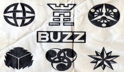

the sixth glyph would be a tattoo if I ever got one.
You could even say it glows.

Skeletal Pyramid [top view]

On The Mantle

Sunday, November 13, 2011

Construction Zone


Monday, August 22, 2011

UPWORDS Letter Game

Meat-Boys Crave Goo. Mild Clip? Fine Nude Tomb. Quilt X-Ray Tank. Hush, Spaz! Judge Pew. (Pudge Jew)


MessagEase KBD Sobé Mayo Mope Tail Ruge Dude PC


MessagEase KBD & Slam Tude IO Meld Pube Goya Cope


MessagEase KBD & Epic Tune Slam Hire Malt Dude Spay Goat Bone IO


Monday, August 15, 2011

Friday, July 15, 2011

Thursday, July 7, 2011

Chrome is too damn bright!

I use white text and orange links on a black background for my surfing.
How?

In Firefox:
Go to Tools-> Options-> Content tab-> Advanced button,
Set the color chips,
Uncheck "Use colors specified on web pages"
To toggle this effect, get the nifty "toggleDocumentColors" Add-On for a toolbar CSS toggle icon (get it from the customize dialog for the toolbar)

In IE:
Go to Tools-> Internet Options-> General tab
Click "Colors" to set the color chips,

Click "Accesibility Options"
Check "Ignore colors present on webpages"


For Chrome:
Find the application
(C:\Users\Root\AppData\Local\Google\Chrome)

Shift right-click to get a command line, and run it:
chrome
--enable-user-stylesheet

Then edit Custom.css
(C:\Users\Root\AppData\Local\Google\Chrome\User Data\Default\User StyleSheets)

Here's mine:

*{
color:#FFF!important;
background-color:#000!important;
background-image:url();
:link{color:#F90!important;
:visited{color:#940!important;
}

Happy Surfing. The Custom.css file take effect the moment you save changes,

...so table {border:1;} for instance, would immediately reveal all the page table borders


Table rendering is extremely broken in FireFox5 for me right now.
That's why I needed to darken my Chrome.

Saturday, June 11, 2011

My #Construx Meat Boys

Their Web vs. My Web.css

Their Web
Bright, and almost everything is needlessly an image.
Some sites use table-cell background images as buttons, not actual FORM buttons that are stylable, and behave. Some sites are all Images, otherwise I tame them with:
toggleDocumentColors. Firefox. When the web is too bright. PCs are better in the Dark!


My Web
much better. just the sweet, sweet data: